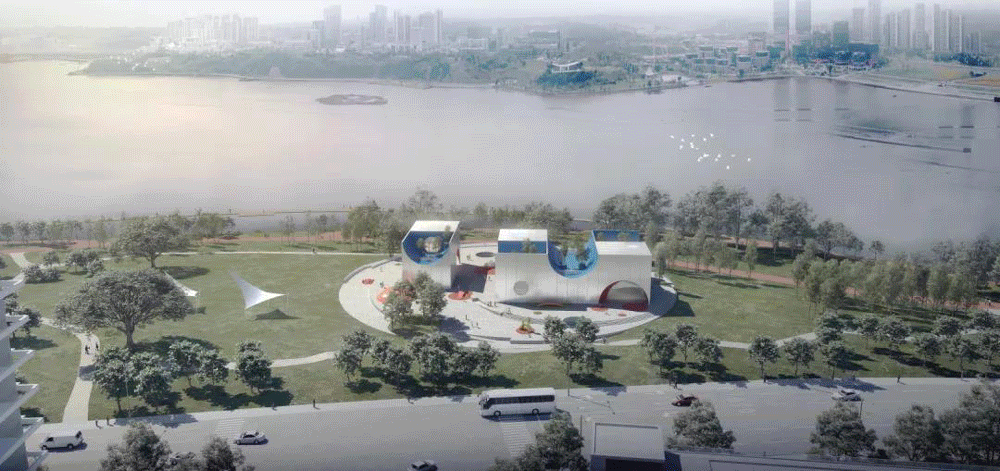
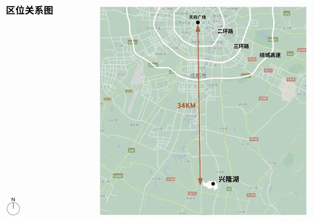
Park City —— Tianfu New Area Xinglong Lake
with total planning area of 5360 mu
4500 mu of wetland water
more than 10million cubic meters of water stored
8.8km shoreline
with 600 Thousand RMB Bonus,
The Visual Identity System Global Open Call
Starts Now!
》》》》
The First A8 Master Residency is Here!
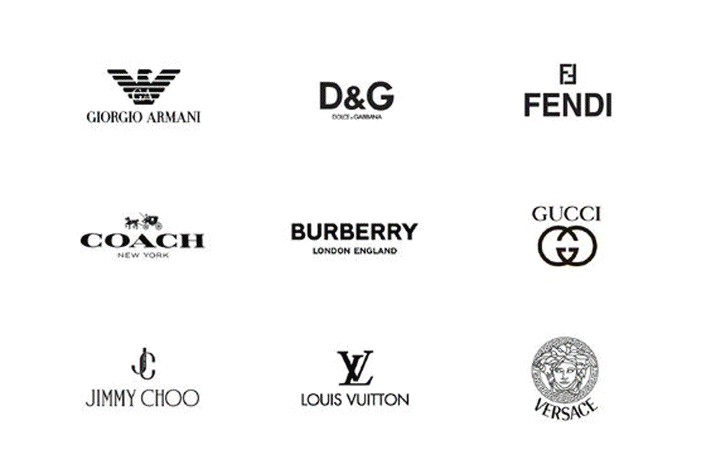
01 What is Visual Identity
Visual Identity System includes multiple meanings such as signals, signs, explanations, knowledge and predictions. It pays attention to people's psychological and physiological feelings, as well as the overall construction of the design object. It makes people feel amiable, and also have an overall identification of the design object. In modern society, demand of the information relationship between people and the environment increases significantly. From a small building to a large region, or even a city, a scientific and humanized guiding design is required.
4 Elements of Visual Identity
Logo is the primary visual expression of the brand, and the graphic symbol of the brand and its identity. The logo should include a memorable image, as well as telling what your brand or service is doing.
Fonts & Typography
Fonts and typography will affect the visual perception conveyed by the brand to users. Different types of font will have different influences on the audiences, including different readability. Good visual design tends to keep the fonts simple, but at the same time consider the emotion and personality each font conveys.
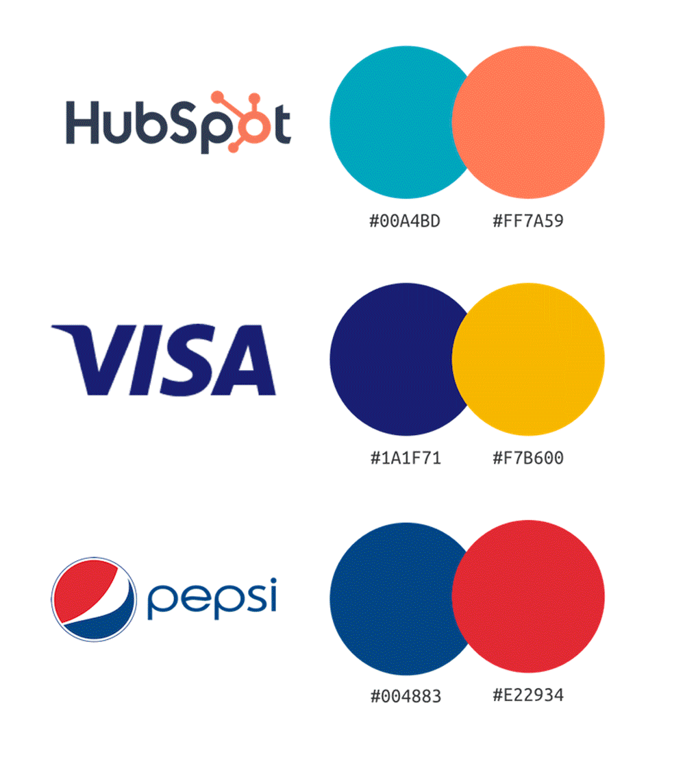
Color Palette
The color palette should fit the emotion and message the brand wishes to convey. According to one research, color enhances brand recognition by up to 80%. Differentiated color can command attention, cut through the visual clutter, and affect people’s moods and attitudes.
Photography & Imagery
Images make brands more approachable, allowing users to connect and interact with it. It optimizes the first impression, so the imagery used on the visual design must help to form a positive impression of the users.
02 From Brand VI to City VI
02-1 品牌的Visual Identity
02-2 City Visual Identity
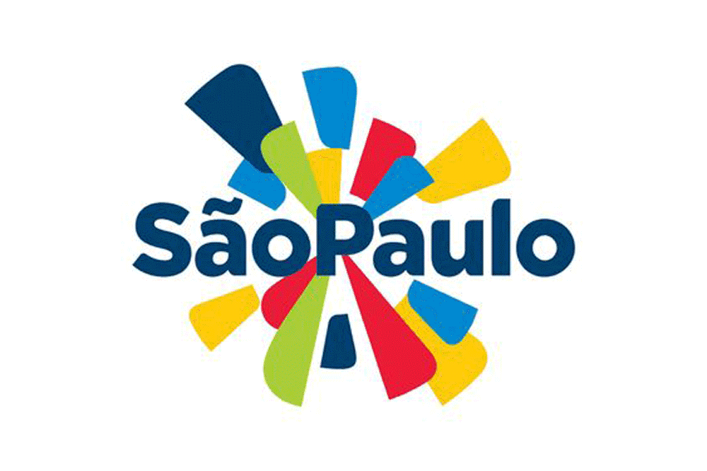
In the planning and construction of a city, visual identity system is only a small part, so people often ignore its existence. But people find that they know nothing about the city without the VI system. City visual identity represents the brand of the city, and the city brand has been considered as an important element of the city tourism economy. The development of these visual systems also reflects the improvement of the city's attitude, degree of civilization and cultural accomplishment. At the same time, the design of logos, images, fonts and the integration of various colors in the VI system reflects the identity characteristics of the city and conveys the history, geography, culture and emotion related to the city, which is an important factor for the future development of the city.
03 Visual Identity in Contemporary Park
As an important part of the city, the contemporary city park not only affects the life quality of citizens, but also beatifies the city and adjusts the urban atmosphere. Parks with high quality can often become a symbol of a city, but also the embodiment of the city's culture. The visual identity system of city park is the first impression when people walk into the park. It needs to be carefully designed and arranged to enhance the natural atmosphere of the park, and express cultural heritage, so as to make the park have a unique IP and identification.
03-1 Norway's National Parks
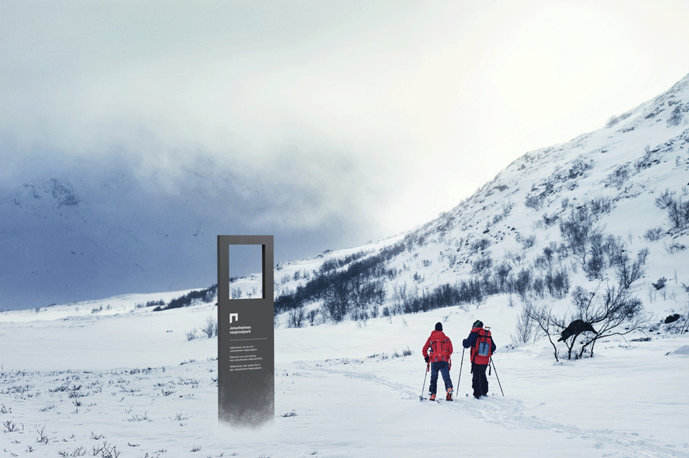
Visual identity and a brand strategy for Norway’s National Parks encompasses 44 parks, visitor centers, and national villages and municipalities, and the strategy and design aim to tie stakeholders closer together, as well as to communicate the important message of both visit and protect to users and visitors. Nature has an important place in all Norwegians souls – the joy of ascending a mountain, experiencing the nature’s silence, or feeling the power of the untouched surroundings. The national parks represent some of our nature’s most beautiful parts. It should be experienced, but at the same time be protected.
The visual identity is built on the concept of a portal. A portal is an entrance, or a gate, which symbolizes the transition between two dimensions: the traversing between the cultivated and the natural. The unifying visual identity opens a gate to these new experiences, it lowers the barriers for visiting, and facilitates the increased knowledge of our precious surroundings. The logo represents a portal – a protective frame shaped by a natural landscape curve. It shows the interaction between culture and nature, as well as the balance between visit and protection.
03-2 PARC RIVES DE SEINE
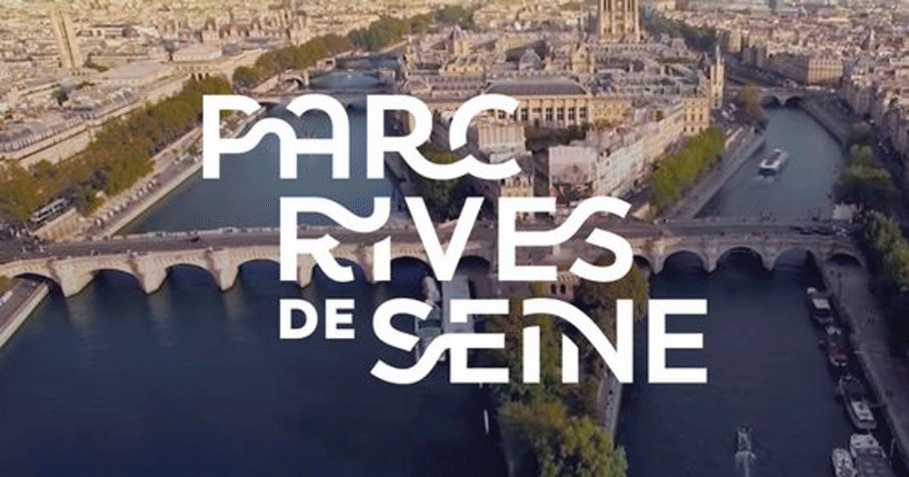
PARC RIVES DE SEINE is 7 kilometers long, starting from the Bastille Square in the east and ending at the Eiffel Tower in the west. In order to bring this riverside space energy, the City of Paris created the brand "PARC RIVES DE SEINE". It aims to show a free Paris, calling on the citizens to be the masters of the Seine. PARC RIVES DE SEINE shows that anything is possible in Paris, and tells the world what the city is all about: free, innovative, dynamic, cheerful, elegant and open.
The connection of the letters of PARC RIVES DE SEINE were inspired by the Seine river and its bridges’ very essence. Numbering 37 bridges, they span the river, connecting people and places physically and symbolically. The exclusive typography pays tribute to these bridges, with each letter of the alphabet reflecting the shape of a bridge orientation. From A to Z, you will discover Parisian bridges from Iéna to Sully. The layout of the logo is also like an acrostic poetry in which Paris is smartly hidden. From logo to sign, and finally to the campaign that covered more than 2,000 billboards across Paris, the designers used a vibrant and dynamic brand language to create a happy and appealing identity for this unique place, with snapshots of real Parisians that illustrate the possibilities of moments in life.
03-3 Setouchi Triennale
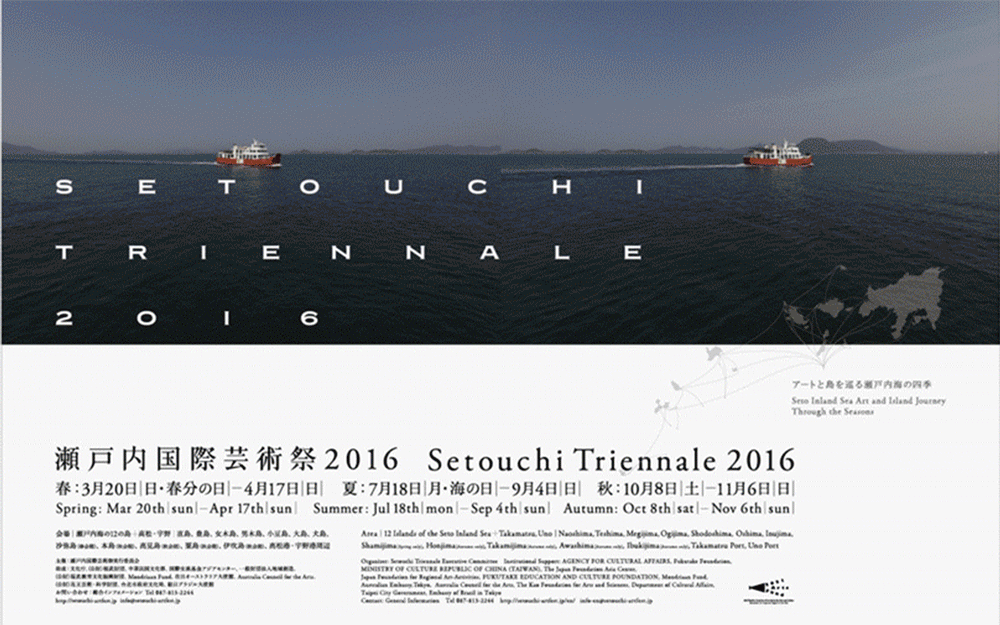
Setouchi Triennale is an international contemporary art festival held on the island group of SetoNaikai in Japan. It was founded in 2010 and held every three years. The festival invites famous curators and artists from Japan and around the world to display art works, various artists, troupes and orchestras. At the same time, it combines with local traditional skills and festivals, centered on the islands of SetoNaikai. Each project is distributed among the islands dotted in SetoNaikai. This natural way of displaying works allows visitors to see the exhibition and travel simultaneously, which is fresh and interesting. Setouchi Triennale has become a tourist destination for young artists around the world.
The visual identity of Setouchi Triennale was designed by Kenya Hara. Flags, posters, tickets, maps, apps, volunteer clothes, brochures are well presented visually through the design of font, color, theme and other elements. On the basis of a unified style, the visual changes according to the theme of each session. For example, the main visual design of 2019 features deep-sea fish as the element, while the theme of the past year has been islands and sea scenery, which not only reflects the designer's whimsical ideas combining local cultural characteristics, but also reflects the festival's consistent philosophy of pursuing change and innovation.
03-4 New York City Central Park
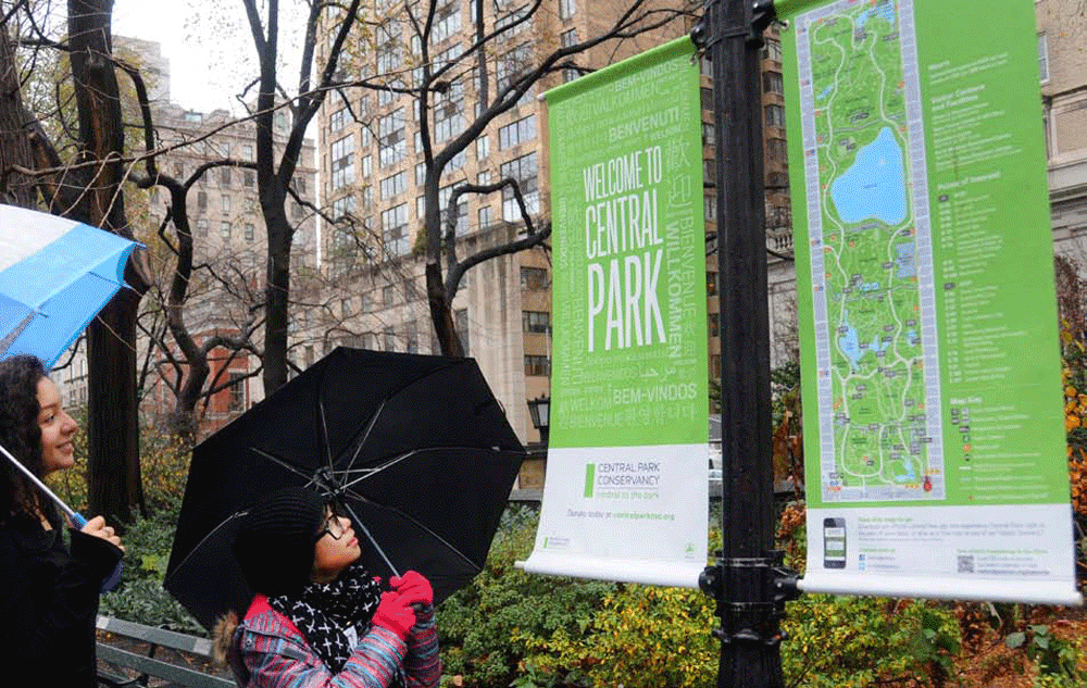
Green and friendly is the theme of New York City Central Park, and FB Titling Gothic is the font of the visual identity. The comprehensive rebranding by Mc GarryBowen met the Central Park Conservancy’s goal of making the 778-acre landmark richer and more welcoming. The VI system of the park is now extended to all digital and print media for a seamless visitor experience.
The core visual of the identity comes from the park itself: a long, green rectangle derived from an overhead map view. This is reflected in the logo and promotional materials, like the flyer and banner. For informational and wayfinding signs throughout the park a less extreme width of Titling Gothic is used, but the color, portrait orientation, and typography remain consistent.
04 New IP of Tianfu New Area:
Park City —— Xinglong Lake VI System Design
"Park City" in Tianfu New Area takes ecology as the priority, green development as the lead, people as the core, and creates a great park city form with "people, city, environment and industry" highly harmonious. Since 2020, Tianfu New Area has started the overall renovation around Xinglong Lake to make it thelandmark of the city. Renovation projects include “Demonstration Site of Garden City: Tianfu New Area Xinglong Lake DUO Competition” planned and executed by A8 Design Center. As two themes of the competition, "Children's Art Center" and "Roadshow Center" have received 153 architects and individual registrations from the global in total. The superior projects are under construction now.
In terms of industrial planning and regional positioning, it mainly undertakes core functions such as technological innovation (core area of scientific research and development), foreign exchange (world tourist destination), and ecological leisure. Therefore, it has a high-quality ecological environment, dense vegetation, excellent water quality, and species diversity, and it has the responsibility of showing the city's green and harmonious city card. It is also a popular tourist destination and a place for major events in the city. Top sports events and famous cultural exhibitions would regularly be held. It is also a public park with unique IP for the people. It meets the needs of people for leisure and recreation, sports and fitness, parent-child entertainment, and cultural and artistic activities.
The registered designers (studios) and the principal architect of this project must have experiences in the design of large public facilities such as museums, art galleries, etc., or the design of district VI system.
1、Design must be completed on the basis of a understanding of Xinglong Lake's positioning, vision, and development context, and the logic and process of the work must reflect a certain locality;
2、Design shall be integrated and systematic;
3、Design must reflect the concept of "Park City".
This residency project is designed to establish a complete visual identity system. The submission form is the manual of the brand visual identity design and electronic documents, including but not limited to:
一. Basic
1. Logo
2. Logo design concept
3. Standard fonts in Chinese and English
4. Standard formatting combinations between logos and fonts
5. Safe space for fogos and fonts
6. Logo basic application specification
7. Special printing style
8. The standard color
9. The secondary (auxiliary) color
10. Auxiliary graphics
二. Environment Image
1. Regional banner
2. Department banner
3. Road flag
4. Table runner
5. Standard design of advertisement format for light boxes and street signs
6. Bus identification design
三.Exterior Environment Area Guide
1. Identification of exits and pathways
2. Guide icon
3. Ground orientation
4. Regional guide board
5. Road direction signs
6. Road image signs
7. No parking signs
8. Warning signs
9. Manhole cover
05-3 Schedule
January 21 - January 31
(Deadline of registration: 23:59 on January 31)
Collection of designer (studio) works
February 1 - February 4
The designer's portfolio is screened,confirm the selected designer
February 5
Selected designer announcement
February 6 - February 24
Design Stage I:Submit the preliminary scheme design in no less than 3 directions
February 24 - February 26
Internal review discussion,identify one of the options as a specific direction for further development
February 26 - March 18
Design Stage II:Continue to deepen the selected direction, complete and submit the specified design content
March 18 - March 21
Final confirmation of the completed design
March 22
Design Result Announcement
05-4 Registration
1、Designers participating in the residency project, please send your profile and portfolio to a8dc@a8dc.cn, and indicate in the title "VI System at Xinglong Lake Residency + Designer(studio) name". We will conduct internal screening after receiving the application email, and finally confirm one(group) designer;
2、Selected designer/studio can receive design fee of RMB 600,000 (pre-tax, not including travel);
3、The deadline for the submission of personal profiles and portfolios is 23:59 on January 31 (Sunday);
4、Designers participating in the delivery must ensure the authenticity of their resumes and the originality, uniqueness of the portfolio and the integrity of intellectual property rights;
5、If you have any questions, please add A8 Design Center WeChat: 187 2846 5309.